
Why We Source Every Compression Percentage (And Why 1.6% Is the Honest Number)
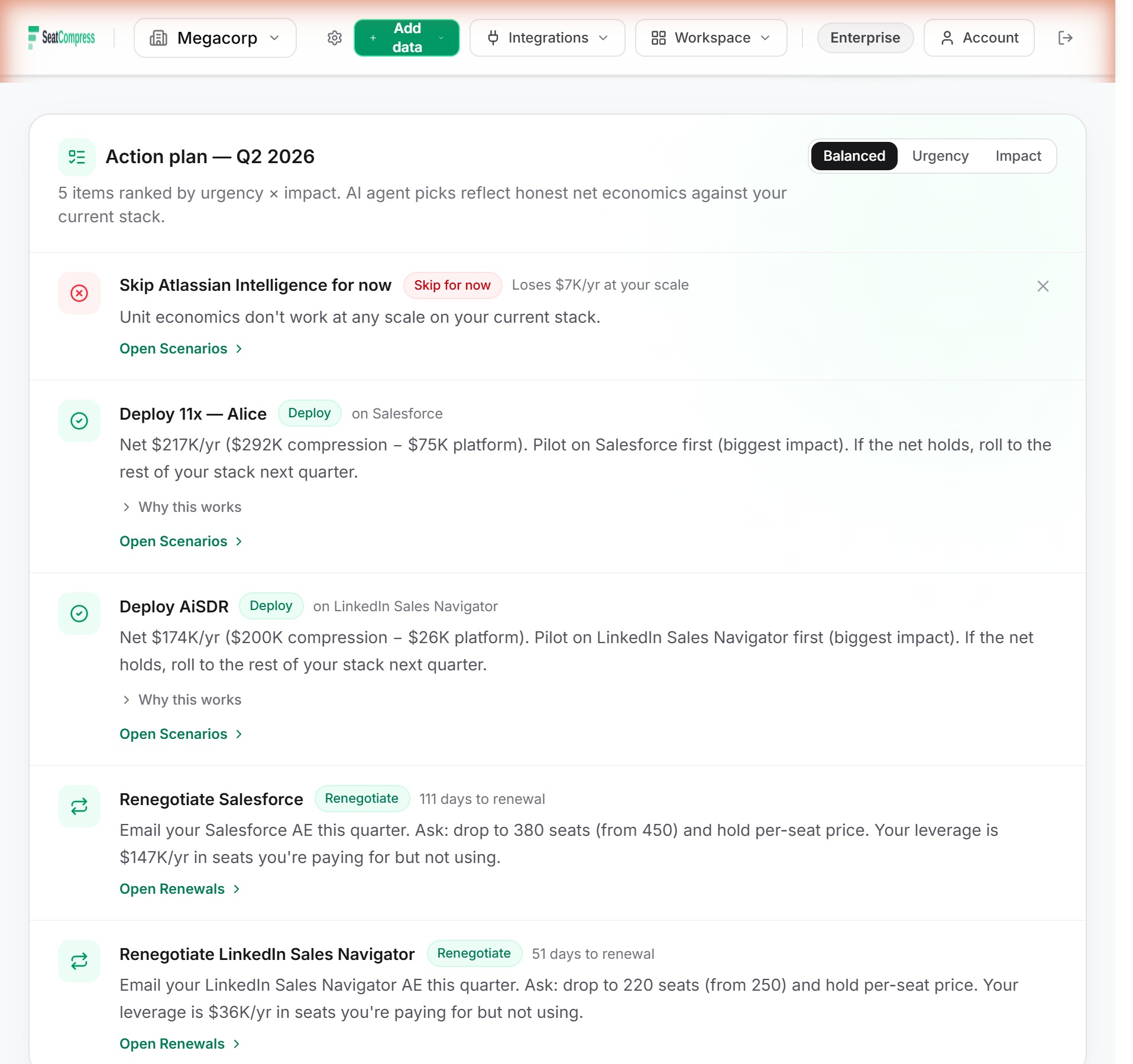
Out of 682 AI-agent compression rows in the SeatCompress catalog, 11 of them — 1.6% — trace to a public source with a literal claim quote. The other 671 are explicitly tagged as algorithm-derived estimates. We put a small gray "Estimate" badge on every one of them in the dashboard. Hover and you'll see the rationale, not a fabricated URL.
Most SaaS spend platforms wouldn't tell you that ratio. We're leading with it because the alternative — opaque numbers, no provenance, "trust us, we're experts" — is the worse trust contract. A CFO reviewing your spend stack should know which numbers are anchored to a Klarna case study and which are someone's calibrated judgment, and any tool that flattens that distinction has a credibility problem it isn't admitting.
Try the free calculator — 15 seconds, no signup. You'll see the confidence badges on every AI replacement recommendation.
The thing nobody in our category will publish
Pull up Vendr's website. They'll cite "$X billion in savings achieved" with no methodology page behind it. Productiv's marketing talks about "compression %" as if it were a single defined number rather than a vendor-by-vendor judgment call. Zylo publishes opaque benchmarks. Tropic shows "potential savings" with no source attribution. (We walked through the architectural gap behind these in the Zylo vs Vendr vs Productiv comparison.)
None of them publish a sourced-versus-derived ratio for their compression claims. We don't think that's because they don't have one. We think it's because publishing it would force a conversation about how much of their dashboard is judgment versus citation, and that conversation is uncomfortable for any platform that hasn't built the provenance plumbing to answer honestly.
So here's our number. Public. Reproducible. 11 sourced, 671 derived, 682 total. The rest of this post explains why.
What a "compression percentage" actually is
A SeatCompress catalog row says something like Decagon compresses 60% of Zendesk Tier-1 ticket volume. That number drives every downstream calculation: how many Zendesk seats are theoretically reclaimable, what the per-tool gross savings are, whether the agent clears its unlock threshold, what the year-1 realistic line item looks like after the realization discount.
If the number is wrong — say it's actually 35% — the whole stack of CFO-facing numbers in that vendor's column is wrong too. There are three ways to get to a defensible compression %:
- Cite a public source. Vendor case study, analyst report, trade press citing a named customer. Apply a discount factor because vendors inflate, then clamp by agent class so a cherry-picked outlier can't pull the number above what's structurally plausible.
- Make a judgment call. Workflow analysis, comparable-agent reasoning, internal calibration. Be honest that it's a calibration, not a citation.
- Make up a number that looks plausible. This is what most platforms do. We don't.
Three years ago a CFO at a 1,500-employee company called us out on a Sierra → Zendesk row. We had 65% compression. We couldn't tell him where the number came from. He'd read three different Sierra case studies that quoted different deflection rates and wanted to know how our 65% reconciled. We didn't have a good answer, because the number was internal judgment that had been written down as if it were a fact.
That conversation is why this methodology exists.
Piece one: the deriveCompressionPct gate
Every NEW write to an AgentToolImpact row in the catalog now goes through a single function called deriveCompressionPct. The BYO AI agent dialog, the API routes, the apply scripts, and the LLM-driven catalog refresh all call into the same gate. It does two things.
Step one: the discount factor. Take the headline claim from the source — say, Klarna says Decagon deflects 75% of inbound tickets — and multiply by a discount factor that reflects how much of the marketing number a typical customer actually realizes. Case studies (named customer, vendor-published) get a 0.70 multiplier. Vendor marketing pages ("up to 80% time savings") get 0.50 — heavier hedge against headline inflation. Analyst reports (Gartner, Forrester, IDC) get 0.85 because they've already pre-discounted against vendor claims. Trade press citing a customer interview gets 0.60. Explicit judgment passes through at 1.0 but carries an "Estimate" badge in the UI.
Klarna's 75% × 0.70 = 0.525. That's the raw derived number.
Step two: the categorical cap. Even a rock-solid case study can't push a number past the cap for the agent's class. A vertical replacement agent (Decagon, Sierra, AiSDR — designed to replace seats in a specific tool) tops out at 65%. An assistant agent (Workspace Agents, Notion AI) tops out at 30%. Augmentation (Jasper or Copy.ai on marketing tools — adds value without removing seats) tops out at 20%. Horizontal AI (Claude Team, general-purpose chatbots) tops out at 15%. The cap is set at the precedent floor of the existing catalog, tight enough that a cherry-picked outlier can't break the action-plan engine downstream.
Decagon is vertical replacement. Raw 0.525 is below the 0.65 cap, so it passes. If Klarna's number had been 95%, the derived 0.665 would clamp down to the 0.65 cap and the reason field would record the clamp.
Four cap-clamps fired during the 2026-05-10 historical backfill against tools that have since been removed from the catalog (0.45–0.50 raw values inflating against the 0.20 augmentation cap). None on Intercom Fin — Fin's 0.50–0.60 deflection claims are vertical-replacement class (0.65 cap), comfortably within bounds, so the algorithm passed them through unmodified and they sit at those values in seed today. The algorithm clamps when it needs to and doesn't claim a clamp fired when it didn't.
Piece two: the 11 sourced anchors
We ran the catalog through deriveCompressionPct and tried to source every compression number against a public URL. Four parallel subagents researching about 170 rows each, every claim cross-checked against vendor case studies, analyst reports, and trade press.
The result: 11 rows trace to a sourced anchor with a real URL and a literal claim quote. The rest got tagged as judgment — internal estimate, no fabricated URL.
The 11:
- Sonos → Sierra (case study, vertical_replacement cap)
- Decagon → Intercom (one customer case study; specific customer not named in the source data we ingested)
- GitHub Copilot → GitHub Enterprise
- Intercom Fin (two rows, vendor marketing post-discount)
- Glean → Confluence
- Atlassian Intelligence → Confluence
- Moveworks → ServiceNow and Moveworks → Freshservice
- Regie.ai → Outreach
- ThoughtSpot Spotter → Power BI
That's it. The rest are calibrated judgment, including most of the catalog's biggest dollar lines — the Sierra rows beyond Sonos, the AiSDR rows, the M365 Copilot rows, the Claude bundle rows.
This is the part competitors won't tell you. Most AI-agent compression claims aren't published anywhere. Vendors publish resolution rates, productivity-gain percentages, "up to" headlines, and aggregate testimonial language. Almost none publish the specific number a CFO needs: for agent X targeting tool Y at company size Z, what percentage of those tool-Y seats does agent X actually compress. That's the number this product runs on, and it's almost never in print.
So we tag it honestly. The dashboard shows you which numbers we sourced (small green dot, hover reveals the source URL and the literal claim quote) and which are calibrated judgment (small gray dot, hover reveals the rationale). Pretending all 682 rows were sourced would be a worse trust contract than admitting only 11 are. We chose the worse-looking option because it's the more honest option.
Piece three: the UI confidence badges
The badges live on every surface that renders a compression %. Tool Inventory, Scenarios tab, the per-tool best-agent picker, the catalog suggestion preview, the renewals annotations. Four states:
- Green dot, "Sourced": the row traces to a named-customer case study. Hover shows the literal quote from the source page, plus a clickable link.
- Amber dot, "Sourced": sourced from vendor marketing or analyst research. Same hover treatment.
- Gray dot, "Sourced": sourced from trade press citing a customer interview. Lower confidence but still anchored.
- Italic gray, "Estimate": internal calibration. Hover shows the calibration rationale. No URL because there isn't one.
The hover never reveals the discount factor or the raw vendor headline — only the post-discount, post-cap-clamp number that ends up in the catalog. That's deliberate. Showing you "Klarna claims 75%, we derived 53% after discount and class cap" turns every tooltip into a math problem. Showing you the literal claim text from the vendor's case-study URL, with the source link clickable, gives you the same epistemic anchor without the busywork.
If you want the discount-factor math, the algorithm is open in the codebase. The dashboard tooltip is for the CFO, not the engineer.
Why competitors' opaque benchmarks should make CFOs nervous
A practical test. Go to your current SaaS spend platform — Zylo, Vendr, Productiv, Tropic, whoever — and find a compression percentage in their dashboard. Right-click it. Hover it. Look for a source URL.
You won't find one. The benchmarks are presented as facts. The methodology isn't published. There's no badge distinguishing "we have a Klarna case study for this row" from "we calibrated this internally three years ago and never re-checked."
This is fine until a vendor pushes back in a renewal call. Then it's not fine. Your procurement team brings the platform's number to the table. The vendor's CSM asks where it came from. Your team can't answer. Vendor counters with their own benchmark — which they also can't source — and now you're in a credibility fight neither side can win because neither side has receipts.
The same pattern shows up in two adjacent surfaces. Peer-pricing benchmarks — where platforms tell you your Workday rate is above the median for your size bucket — have the same opacity problem. Vendr's methodology page on peer data is two paragraphs. Productiv's is one. Tropic doesn't have one. SeatCompress's VendorBenchmark rows carry a sourceUrl field internally for every median; we strip it at the API boundary because the v1 dataset is hand-curated from public sources (Vendr, Tropic, vendor pricing pages) and we don't want the chip tooltip to promise more than the dataset delivers. The v2 trajectory replaces those with anonymized customer-derived medians once we hit 10+ customers per (vendor, bucket) cell. Same shape, better data. The methodology page is honest about which mode we're in.
The other adjacent surface is per-employee pricing on HRIS, where the lever is the rate against the peer median rather than seat count. The trust contract is identical — every number either traces to a citation or is honestly tagged as derived.
What CFOs should ask their current SaaS spend tool
Five questions. None of them require the vendor to do work they shouldn't already be doing.
- For your top three vendors by spend, what's the source URL behind the compression or savings percentage you show me? If they can't produce a URL, the number is judgment. That's fine — but it should be labeled judgment, not fact.
- What's your sourced-versus-derived ratio across your full catalog? If they don't know, the answer is implicitly zero or undisclosed. Ours is 1.6%. We expect to roughly triple that over the next six months as the vendor-changelog cron lands and as a focused sourcing pass goes after the highest-leverage rows. We commit to publishing the number again when it changes.
- When you discount a vendor's marketing claim, what factor do you use? Ours is published: 0.70 case study, 0.50 vendor marketing, 0.85 analyst, 0.60 trade press, 1.0 judgment passthrough with explicit tagging. If the answer is "we don't discount" or "it's proprietary," the dashboard is taking vendor pitch numbers at face value.
- What's the cap on an individual compression claim? Is it the same across agent types? Ours: 65% for vertical replacement, 30% assistant, 20% augmentation, 15% horizontal AI. No exceptions. A cherry-picked Klarna outlier can't drag the catalog past defensibility.
- When the cap fires on a number you originally published, do you tell anyone? Ours fired four times during the 2026-05-10 historical backfill — pulling 45–50% raw values down to the 20% augmentation cap against tools that have since been removed from the catalog. We documented every one in the audit trail, including the rows where the cap did NOT fire (Intercom Fin's 50–60% claims sat comfortably below the 65% vertical-replacement cap and passed unmodified). If your platform won't tell you when its own algorithm catches an over-claim — or, just as important, when it deliberately doesn't — the dashboard is a marketing document, not a CFO tool.
We're not arguing every CFO should run our methodology. We're arguing every CFO should be able to see the methodology of the platform they're paying — and most platforms in this category have built the dashboard without building the provenance underneath.
The honest admission, one more time
1.6% sourced is low. We know. The number is in this post's title because we'd rather lead with it than have a procurement team find it on a code-review reading of our open methodology and feel like they caught us.
We're working to raise it. The vendor-changelog cron lands the next iteration of catalog freshness, with automated source-URL capture on every new agent row. A focused subagent pass on the 192 vertical-replacement rows could realistically lift sourced coverage to 5–8% in a half-day's work. The v2 peer benchmark dataset will eventually be anonymized customer-derived medians instead of public-source curation. We have a roadmap.
But the ratio is what it is today. Hiding it behind a confidence wash or a "trust us" page would be the kind of trust failure that's hard to recover from when one CFO asks one hard question. We'd rather take the awkward conversation now, with the actual number visible on every compression chip in the product, than the worse conversation later.
Try the free calculator — 15 seconds, no signup. You'll see the confidence badges on every AI replacement recommendation. Hover the green dots to see the source quotes. Hover the gray ones to see the algorithm rationale. Decide for yourself whether the methodology earns the conclusion.
The bottom line
Every compression % in the SeatCompress catalog is either sourced to a public URL with a literal claim quote, or honestly tagged as algorithm-derived with the rationale visible on hover. The split today is 11 sourced (1.6%) and 671 derived (98.4%). We publish the ratio because the alternative — opaque numbers presented as facts — is what every competitor in this category does and it's a worse trust contract.
The right test for any SaaS spend tool isn't whether its dashboard is pretty. It's whether the CFO can drill down on any single number and see where it came from. If they can't, the dashboard is doing marketing, not finance.
If your renewal calendar has three big vendors in the next six months and your current platform can't tell you the source URL behind its compression numbers, you have a credibility problem at the renewal table that won't surface until the vendor asks for receipts. The 15-second free calculator won't replace your spend platform. It will, however, show you what the receipts side of the conversation looks like.
Find your savings number in 30 seconds.
No signup, no credit card. Get the number, screenshot it, and decide if your CFO needs to know about us.